Go Back
Design System - Obsidi

Design System - Obsidi
Overview
When I joined Obsidi, the organization was at an inflection point. Multiple new products were being built simultaneously, yet the design infrastructure could barely support a single experience. The existing design system consisted of brittle components, inconsistent styling, and no documentation, creating friction for designers, engineers, and ultimately our users.
I led the complete redesign of the Obsidi Design System: rebuilding foundations, creating scalable components, defining governance, and establishing accessibility as a core principle. The result is a unified system that supports Obsidi’s entire ecosystem and enables fast, consistent product delivery.
Teams
Design Team, Engineers, Product Managers
Roles
Visual Design, Prototyping
Problem Statement
Obsidi’s existing design system was no longer fit for purpose. Over time, the system had grown without structure, resulting in an inconsistent and fragmented experience across the platform. Designers often broke components or created new variants because the existing library couldn’t support the needs of emerging features. Colors differed between web and mobile, typography styles were missing key sizes and weights, and core components lacked the responsive behavior required for a multi-device experience.
The system’s fragility also created operational issues. Engineers frequently rebuilt components from scratch because implementation details were unclear or missing, leading to mismatches in spacing, sizes, and states. With no documentation or governance, teams worked in silos, duplicated efforts, and implemented one-off solutions that further worsened the inconsistency.
These challenges surfaced at a critical moment—Obsidi was preparing to launch several new products on tight deadlines. It became clear that the old system would not be able to scale. We needed a new design system that offered consistency, clarity, accessibility, and efficiency across every part of the product ecosystem.
Research
UNCOVERING THE ROOT CAUSES OF DESIGN DEBT ACROSS TEAMS AND PRODUCTS
To understand the full scope of the problem, I began with an in-depth audit of the existing system. This meant reviewing every component, token, and file in the old library, as well as analyzing how designers and engineers were using (and often avoiding) certain elements. The audit revealed a system that lacked structure at every level. Components did not cascade correctly, spacing and typography were applied inconsistently, and colors failed accessibility standards, particularly in dark mode.
Alongside the audit, I conducted interviews with designers, engineers, and product managers. Designers expressed frustration with components that broke when resized, input fields that lacked edge-case handling, and typography that forced them to manually override styles. Engineers described the constant need to rebuild components because the Figma structure didn’t match code realities, and because foundational decisions such as spacing units or color roles had never been defined.

To benchmark best practices, I also analyzed leading design systems and competitive products, focusing on token structures, documentation formats, naming conventions, and accessibility standards. This research phase helped shape a clear understanding of what Obsidi needed: a flexible, scalable system that could support new products and evolving use cases without creating friction for teams or confusion for users.
Users & Stake holders
The design system needed to empower multiple roles:
01
Designers
- Predictable, well-structured components
- Clear naming and documentation
- Full token coverage
- Easy-to-use patterns for PLG (nudges, prompts, onboarding)
- Improved grids, spacing, and visual hierarchy
02
Engineers
- Token consistency
- Reliable variants and states
- Documentation for implementation
- Alignment between design values and code values
- Less rework and fewer one-off components
03
Product Managers
- Patterns that support faster feature delivery
- Predictable UI for new and existing users
- Scalable components for future product lines
- Governance to minimize decision thrash
Insights from all groups shaped the system’s foundations.
Scope
I rebuilt the design system from the ground up, focusing on scalability, accessibility, and multi-product alignment.
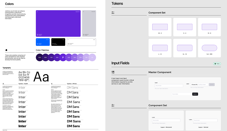
I established a complete token architecture, including:
01
Colors
02
Typography
03
Spacing
04
Border radius
05
Effects
06
Layout & grids
07
Iconography
08
Brand tokens (logos, color roles)
All major components were rebuilt from scratch with full variants, states, and accessibility rules
These including:
Alert • Autocomplete • Breadcrumbs • Buttons • Combobox • Checkbox • Dropdown • Filter • Input Fields • Input OTP • Links • Navigation • Pills • Progress Bar • Radio • Search • Side Navigation • Tabs • Text Area • Toast Notification • Toggle • Tooltip
Each included:
01
Interaction states
02
Light/dark modes
03
Responsive behavior
04
Do/Don't guidelines
05
Token-driven structure

Documentation Site
I created a complete documentation layer with:
01
Component usage guidelines
02
Accessibility notes
03
Code-ready specifications
04
Platform differences
05
Contribution model
06
Version control guidance
Published in Confluence + Figma.

Contributions
LEADING SYSTEM STRATEGY, ACCESSIBILITY, CROSS-FUNCTIONAL ALIGNMENT, AND GOVERNANCE
01
Cross-Functional Leadership
I facilitated system audit workshops and alignment sessions across design, engineering, and product.
02
Token Pipeline Collaboration
I partnered closely with engineering to convert Figma design tokens into implementation-ready code tokens.
03
Governance & Versioning
I authored the contribution model, versioning rules, changelog, and guidelines used by the entire product organization.
04
Accessibility Foundations
I established accessibility standards, corrected contrast failures, and introduced rules for focus states, labels, and keyboard navigation.
05
Future-Proofed System
The system is intentionally designed to scale across multiple future B2B product lines, supporting growth without redesign.

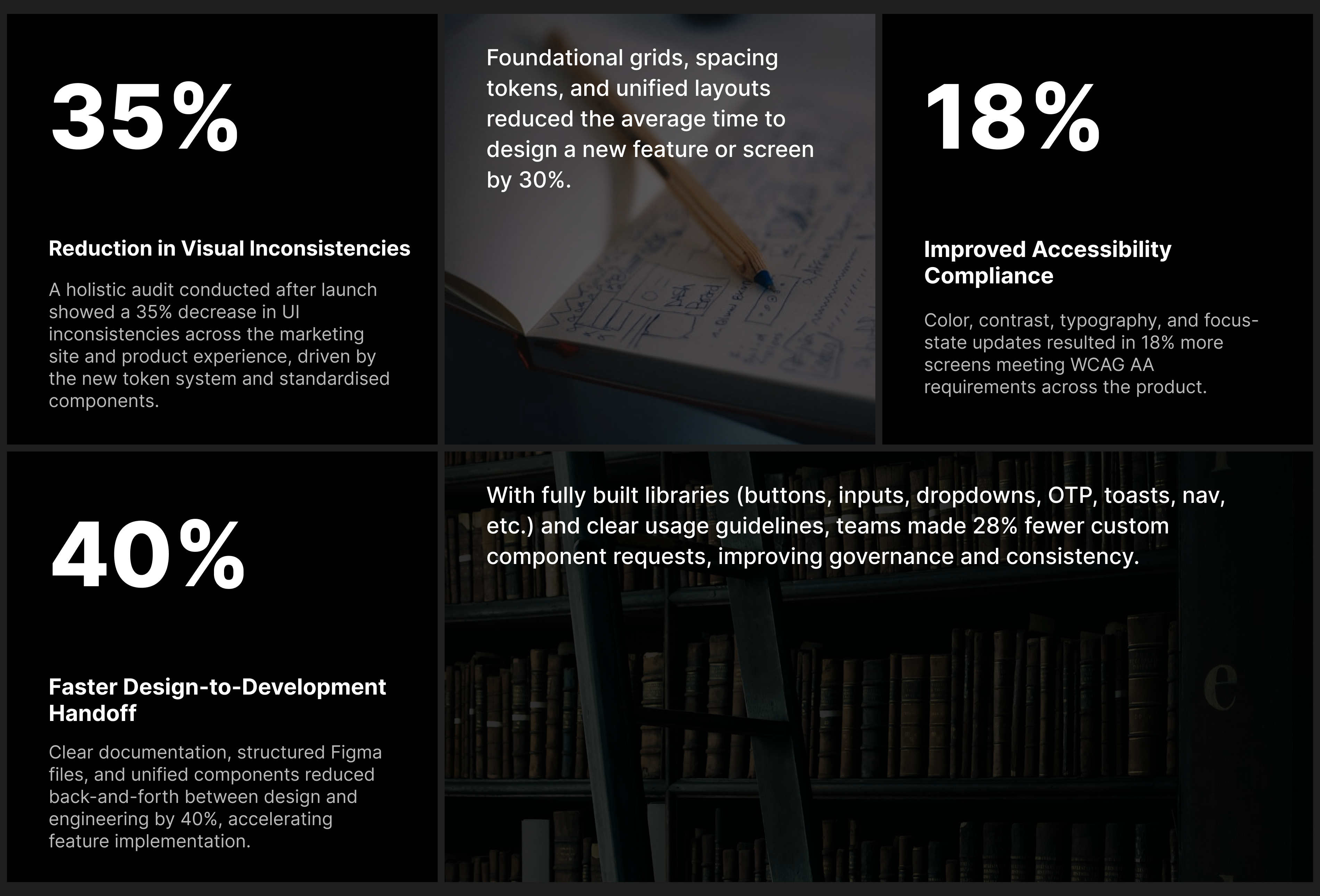
Reflection & Impact
STRONGER BRAND, FASTER WORKFLOWS, AND A UNIFIED MULTI-PRODUCT EXPERIENCE
This project was more than a rebuild, it was a reset of how Obsidi designs, builds, and ships products.
Reflections:
01
Structure
The biggest challenge wasn't the components, it was establishing common language, structure, and process.
02
Documentation
Documentation proved as valuable as the components themselves.
03
Foundations
Strong foundations (tokens, grids, naming) solved more problems than individual redesigns.
04
Alignment
Cross-functional alignment was essential to adoption and longevity.
The new design system now serves as the foundation for Obsidi’s product ecosystem, empowering teams to create consistent, scalable, and human-centered experiences.
Impact:
01
Designers build faster with fewer overrides.
02
Engineers have predictable, implementation-safe components.
03
Product teams ship features more consistently across surfaces.
04
The user experience is more unified, readable, and accessible.
05
Accessibility compliance significantly improved across primary flows.
06
The design-to-development workflow is smoother and more aligned.

