Go Back
Cancer Care


Cancer Care
Overview
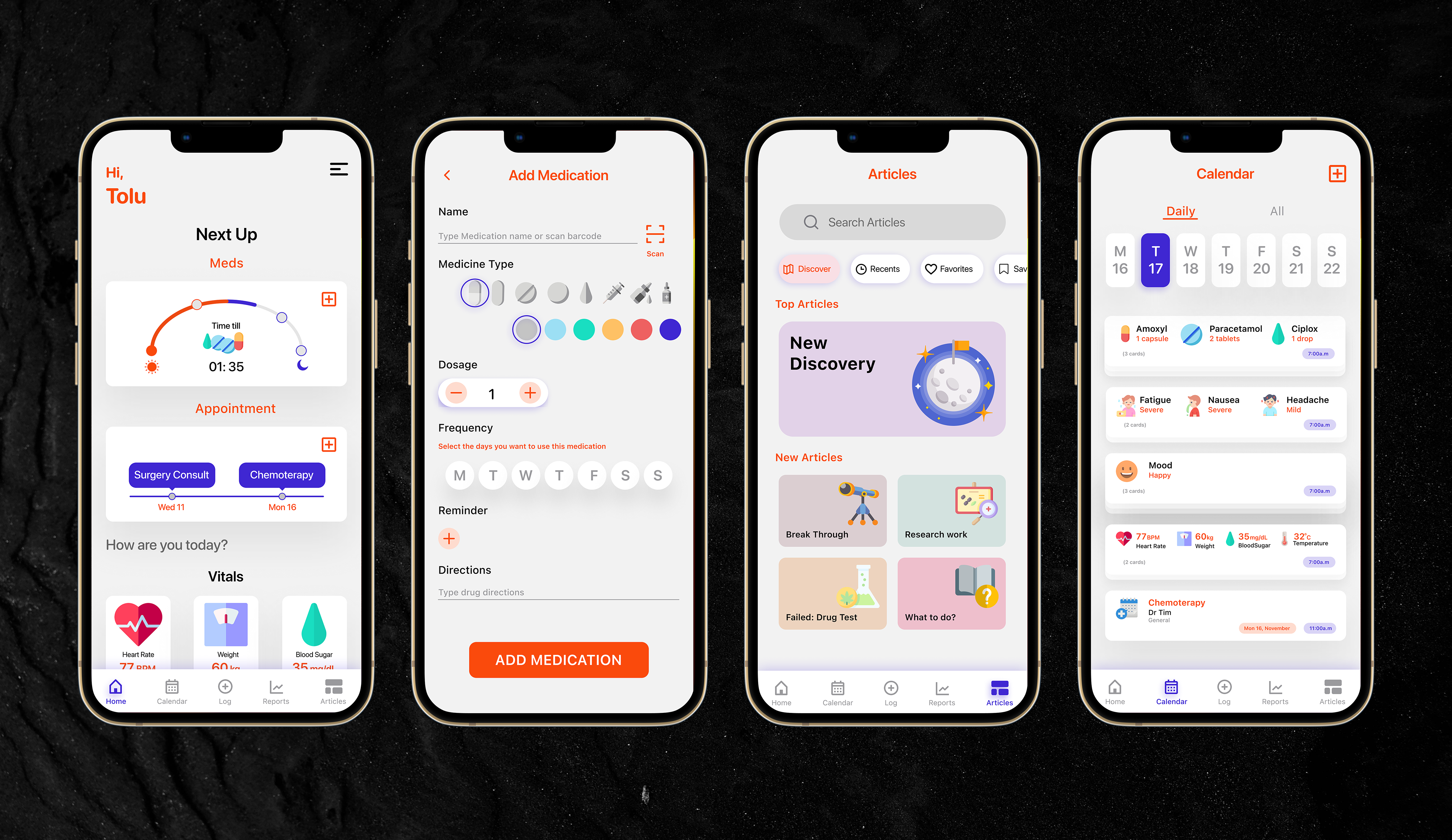
The Cancer Care project aimed to design an intuitive and comprehensive health management solution tailored for cancer patients. The platform enables users to track medications, monitor vitals, log symptoms, and manage appointments, all in one place. By integrating data visualization, credible medical resources, and seamless doctor/caregiver sharing, the solution enhances patient autonomy, improves adherence to treatment plans, and strengthens communication between patients and healthcare providers.
Teams
Project Manager, Engineers
Roles
User research, Visual Design, Information Architecture, Interaction Design, Prototyping, Testing
Problem Statement
Cancer patients often struggle with keeping track of medications, upcoming appointments, and fluctuating symptoms. Existing solutions are either too complex, lack personalization, or fail to integrate critical features such as medication logging, vitals tracking, and seamless doctor communication. This lack of a centralized and user-friendly system leads to missed medications, inconsistent symptom tracking, and poor patient-provider coordination, ultimately affecting treatment outcomes. This led to the question - How can people be equipped with a tool that would help them manage their health better?
To address these issues, I designed a comprehensive yet simple health management solution, empowering cancer patients to track, manage, and share their health data efficiently.
Research
Understanding patient needs & healthcare provider expectations
To build an effective and patient-centered solution, we conducted extensive research, combining user interviews, competitor analysis, and medical expert consultations:
01
User Interviews
Engaged with 15 cancer patients and 5 caregivers, uncovering key pain points such as medication tracking confusion, difficulty recalling symptoms during doctor visits, and lack of access to reliable health information.
02
Competitive analysis
Evaluated 3 existing health tracking apps, identifying gaps in usability, lack of comprehensive symptom tracking, and poor integration with healthcare providers.
03
Medical Expert Consultation
Consulted with 2 oncologists to ensure that tracked vitals and medication schedules aligned with actual patient care needs.
04
Usability Testing of Existing Solutions
Conducted heuristic evaluations on leading apps, revealing an average of 5 usability barriers per platform, including complex navigation and information overload.

Insights from this research informed the core functionality of the platform, prioritizing ease of use, accessibility, and seamless doctor-patient communication.
01
Theme 1: Reminders
- Reminders take away the need to have to constantly check the time.
- Convenience of push notifications are great.
02
Theme 2: Information
- People value personalized and tailored information.
- Ability to also share information on health directly with doctors was important.
03
Theme 3: Tracking
- Can track daily activity and view at a glance.
- Can review progress with tracked data.
- Goal setting in combination with tracking will help improve discipline.

Ideation
User-friendly and actionable health tracking system
With the research insights in hand, I explored 2 design ideas to find the best approach to the solution. I started with some initial sketches to do some quick investigation of what would work.

I conducted an heuristic evaluation of both ideas and moved forward with second option because:
01
Better Usability & Navigation
More straightforward approach to switching between key sections such as medication tracking, appointments, and vitals, ensuring a smoother user experience.
02
Better Data Visualization
More comprehensive and visually clear way to track symptoms, vitals, and medications, making it easier for users to see trends over time.
03
More Efficient Data Input
More efficient input method, such as one-tap logging reducing friction in daily tracking.
I crafted a streamlined, visually intuitive design that enables patients to effortlessly track and manage their health. Key decisions included:
01
Dashboard with At-a-Glance Information
Designed a simplified home screen showing daily medications, upcoming appointments, and vitals in an easy-to-read format.
02
Medication & Symptom Logging
Introduced a one-tap logging system, allowing users to quickly enter medications taken, vitals (heart rate, BP, temperature), and any new symptoms.
03
Progress Reports & Data Visualization
Enabled weekly/monthly symptom and vitals tracking, with visual comparisons to help users spot trends in their health.
04
Seamless Doctor & Caregiver Sharing
Designed an easy way to generate and share detailed health reports via PDF or in-app integration.
05
Medical resource Library
Curated credible health articles directly within the app, allowing patients to save and reference important information.
Visual design
friendly, MODERN, LEGIBLE
The design style was focused on communicating a friendly, mordern and legible tone as CancerCare will be used by users of all ages. The friendly design allows users feel connected to the product which would makes it easier for them to keep using the product to enhance their every day lives. The vibrant illustrations combined with texts on the cards helps older users alongside people with visual impairments or non-native english speakers understand what each element does.

Testing + Iterations
VALIDATING USABILITY, ENGAGEMENT, AND EFFECTIVENESS
I conducted user tests with 10 participants, 5 caregivers, using a combination of the Think-aloud protocol and the Remote usability testing methods. The key things to be evaluated were the Usability, Findability, Learnability of the application. The participants were asked to perform these tasks: Add Medication, Record body vitals, Record mood and symptoms, Read an article, Add appointment.
I conducted the test sessions using Maze which automated the collection of task completion times, user’s paths, heat maps, misclick rates so a combination of these and the SUS form participants completed at the end of the session formed the quantitative data.
From the analysis of the test and data collected, I observed that:
01
85% found medication tracking easier compared to previous methods.
02
92% were able to log vitals in under 10 seconds, improving adherence.
03
16% wanted “shortcuts” to perform tasks without having to click through multiple screens.
04
20% wanted texts on some of the cards to be larger.
05
9% registered difficulty understanding some of the visualization.
Feedback from these sessions led to minor adjustments in the hierarchial organization of features and improved visualization.

01
Simplified Visuals
- I explored some other ideas of how to better visualize the medication and appointments sections for easier understanding.
02
Providing Shortcuts
- Added the ability to add medications and appointments straight from the homepage, this would help to reduce number of clicks, and increase findability.
03
More Information
- Added details on dosage and time to use drugs when you tap on a medication to log on the homepage.
- Action buttons added to call doctor or open up the address on the map to the appointment popup.
- Full details off medication pops up when a drug is tapped on so you can quickly look through it and go back without going to a different page.
![[object Object]](/_next/image?url=https%3A%2F%2Fcdn.sanity.io%2Fimages%2Flixlfaaj%2Fproduction%2F2bc65810400bd3e293999389a7181b3b202da1ad-666x1334.gif&w=640&q=80)

![[object Object]](/_next/image?url=https%3A%2F%2Fcdn.sanity.io%2Fimages%2Flixlfaaj%2Fproduction%2F11cc3918bd3ecbe8a9089806096461defecae578-666x1334.gif&w=640&q=80)

![[object Object]](/_next/image?url=https%3A%2F%2Fcdn.sanity.io%2Fimages%2Flixlfaaj%2Fproduction%2Fc015bfabc6222aa27a679b2543b3ca8f73b03d9d-666x1334.gif&w=640&q=80)

![[object Object]](/_next/image?url=https%3A%2F%2Fcdn.sanity.io%2Fimages%2Flixlfaaj%2Fproduction%2F4b77325f8a69b9ca2333fb482344e5b3edf0cbd1-666x1334.gif&w=640&q=80)

REFLECTION & IMPACT
DRIVING BETTER HEALTH OUTCOMES
The Cancer Health Management Solution successfully addressed key pain points, empowering patients with an intuitive and reliable system.
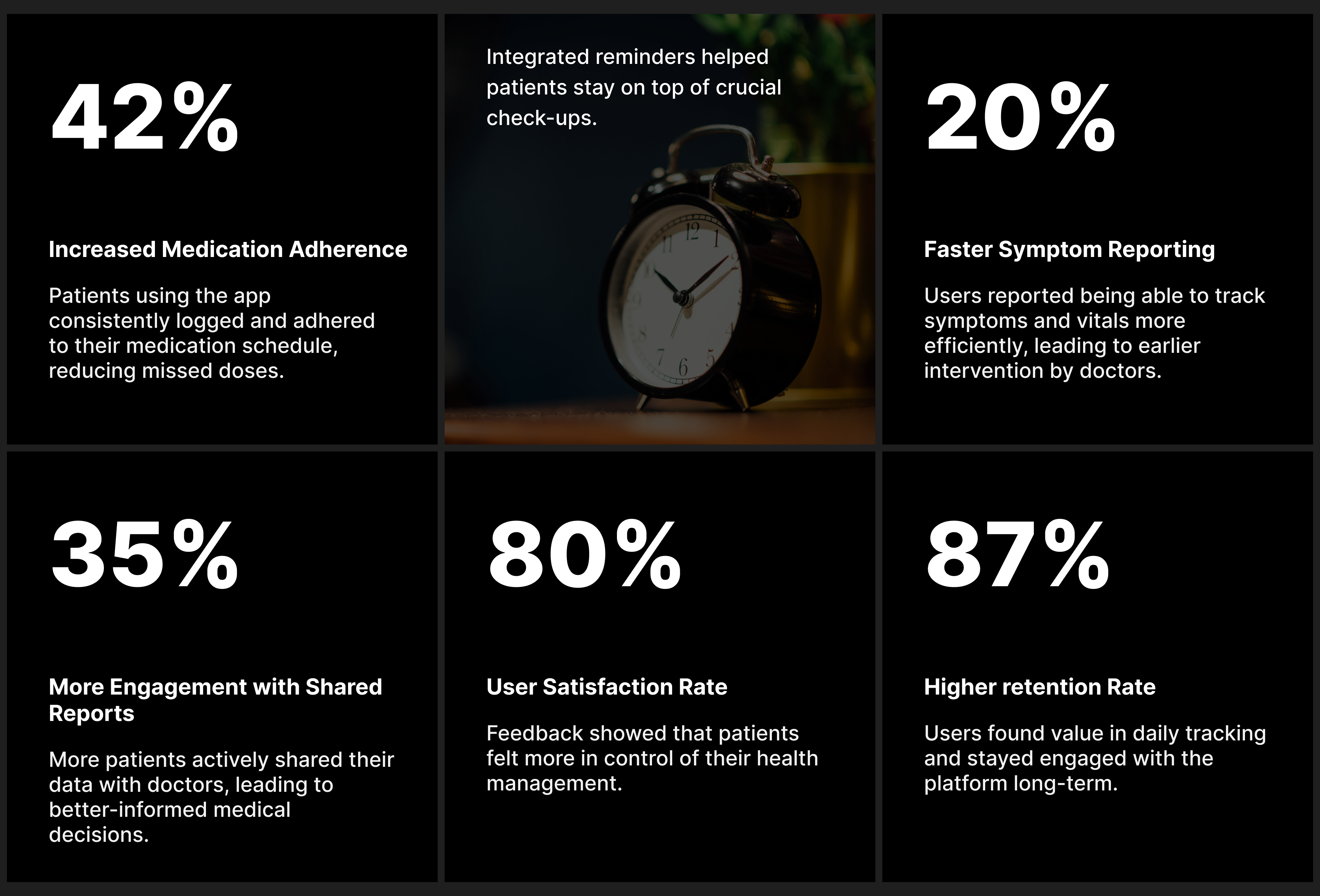
The impact was measurable, leading to:
01
Increased Medication Adherence by 42%
Patients using the app consistently logged and adhered to their medication schedule, reducing missed doses.
02
20% Faster Symptom Reporting
Users reported being able to track symptoms and vitals more efficiently, leading to earlier intervention by doctors.
03
35% More Engagement with Shared Reports
More patients actively shared their data with doctors, leading to better-informed medical decisions.
04
Reduction in Missed Appointments by 28%
Integrated reminders helped patients stay on top of crucial check-ups.
05
80% User Satisfaction Rate
Feedback showed that patients felt more in control of their health management.
Personal Reflection:
This project reinforced the importance of human-centered design in healthcare, balancing simplicity with powerful functionality. Collaborating with patients, caregivers, and medical experts helped me refine my approach to designing for real-world impact, ensuring accessibility, and improving patient outcomes through digital innovation.
Business Impact:
01
Higher Retention Rate of 87%
Users found value in daily tracking and stayed engaged with the platform long-term.

