Go Back
Immersive Labs - Modal


Immersive Labs - Modal
Overview
The success modal plays a crucial role in user experience, providing immediate feedback upon task completion. However, inconsistencies in its implementation across the platform led to unclear user expectations, missed engagement opportunities, and a lack of a cohesive interaction pattern. This project focused on redesigning and standardizing success modals to enhance user satisfaction, create a sense of accomplishment, and ultimately improve engagement. By establishing a clear set of behavioral rules, we aimed to make modal interactions predictable, delightful, and strategically positioned across the platform to reinforce user progress.
Teams
UX Team, Product Managers, Engineers
Roles
Visual Design, Interaction Design, Motion Design, Prototyping
Problem Statement
The platform lacked a consistent approach to success modals, resulting in an incoherent user experience across different workflows. Some modals provided minimal feedback, while others were unnecessarily intrusive or visually inconsistent. This led to user confusion, disengagement, and missed opportunities to reinforce positive behavior. Without a structured pattern for modal appearance, content, and behavior, the platform struggled to effectively signal task completion and encourage continued engagement.
Research
Understanding patient needs & healthcare provider expectations
To inform the redesign, I conducted a thorough audit of existing modals, analyzed user engagement data, and gathered insights from competitors and industry best practices.
01
Modal Audit
Conducted a comprehensive inventory of all existing success modals across the platform to identify inconsistencies in design, copy, placement, and triggering events.
02
Heuristic Evaluation
Evaluated existing modals against UX best practices to pinpoint usability issues, cognitive load, and emotional response gaps.
03
Competitive Analysis
Identified key principles of effective micro-interactions and the role of completion moments in reinforcing user motivation.
04
User Interviews
Spoke with cyber professionals, developers, and executives to understand their expectations and pain points with success modals.
05
Analytics Review
Assessed user engagement data to see how users currently interact with modals—measuring dismissal rates, time spent on modals, and follow-up actions.


Pain points identified:
01
Users often dismissed success modals without reading them, indicating a lack of perceived value.
02
No differentiation between major and minor task completions, leading to modal fatigue.
03
Users wanted more personalized, engaging, and visually distinct success messages.
Ideation
designing a structured and engaging modal system
Based on research insights, I explored multiple approaches to redesign the success modals, ensuring they were both engaging and non-disruptive.
Defining the Ideal Success Modal:
01
Standardized modal hierarchy
Created a tiered system of modals for different completion levels (e.g., minor task completion vs. major milestone).
02
Consistent interaction patterns
Established clear rules for when success modals should appear, ensuring predictable behavior.
03
Emotional design elements
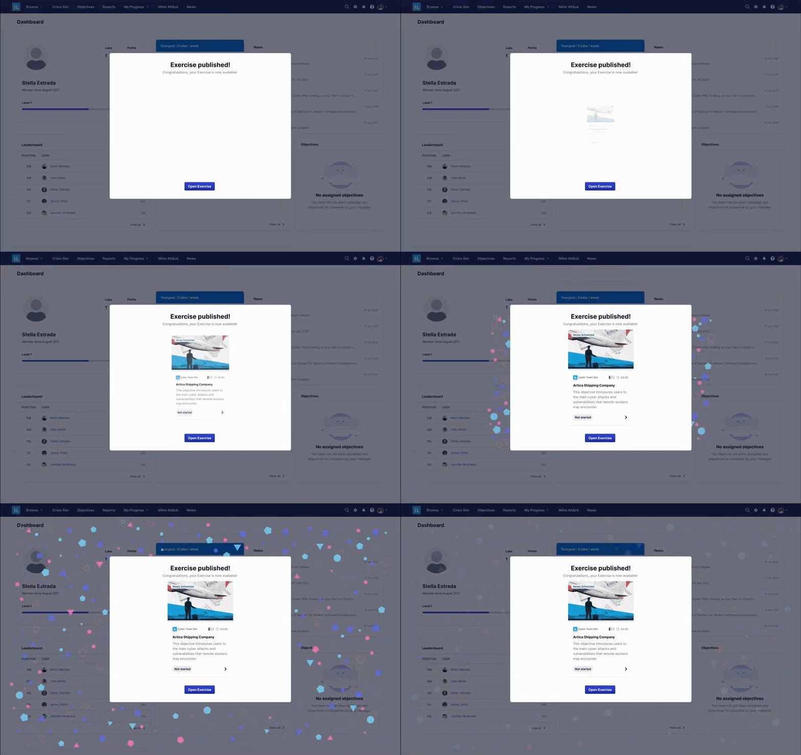
Integrated subtle animations and micro-interactions to make task completion more rewarding.
Wireframing & Prototyping:
01
Created low-fidelity sketches to explore different layout options.
02
Explored alternative success feedback methods (e.g., toast notifications for minor completions, full-screen modals for major achievements).
03
Designed interactive high-fidelity prototypes in Figma and After Effects, testing variations in content, visuals, and animation styles.


Testing + Iterations
VALIDATING THE NEW DESIGN THROUGh user feedback
To validate the effectiveness of the new success modals, I conducted A/B testing and usability studies with real users on the platform. A/B Testing compared two versions of the redesigned success modal: Version A: Simple, informative success message & Version B: Engaging modal with animations and personalized messaging.
Key Metrics measured:
01
Modal Engagement Rate
How many users interacted with it.
02
Dismissal Rate
How often users closed modals without reading.
03
Subsequent User Actions
Did users proceed to engage further in the platform?
Results:
01
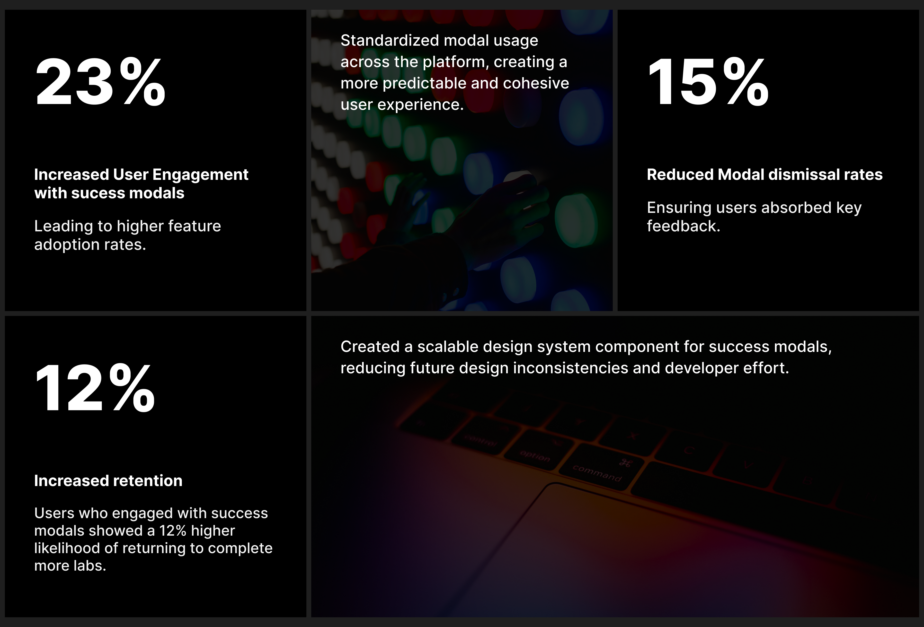
Version B saw a 23% increase in engagement and a 15% decrease in immediate dismissals.
02
Users reported feeling more motivated to complete additional tasks.
Refinements:
01
Reducing cognitive load by keeping text concise.
02
Adjusting animation speed for smoother transitions.
03
Offering a “Don’t show again” option for repetitive tasks.


Reflection & Impact
Measurable Improvements in Engagement and UX Consistency
This design system overhaul delivered tangible improvements that extended beyond visual enhancements, directly contributing to both user engagement and operational efficiency.
Key Outcomes:
01
Standardized modal usage across the platform, creating a more predictable and cohesive user experience.
02
Increased user engagement with success modals by 23%, leading to higher feature adoption rates.
03
Reduced modal dismissal rates by 15%, ensuring users absorbed key feedback.
04
Users who engaged with success modals showed a 12% higher likelihood of returning to complete more labs.
05
Integrated success modals into the platform’s design system, reducing future development time and inconsistencies.
By redesigning success modals from passive UI elements into strategic engagement tools, the platform now reinforces user motivation, enhances usability, and drives meaningful interactions.

