Go Back
Carter

Carter
Overview
Obsidi supports Black professionals on their career journey through jobs, connections, communities, and events. But users often felt overwhelmed and unclear about what to do next in their career.
Carter is an AI-powered Career Co-Pilot designed to guide users toward their goals through personalized plans, actionable steps, and seamless integration with the Obsidi platform.
I led UX, UI, flows, IA, and AI-driven components to build a cohesive system that transforms Obsidi from a static platform into an actionable career coach.
Teams
Data Engineer, Software Engineer
Roles
User research, Visual Design, Prototyping, UX Design, Front-End Development, User Testing
Problem Statement
Users come to Obsidi with ambitious career goals: finding a new job, growing their skills, or expanding their network, but often feel overwhelmed and unsure of where to start. Existing tools across the platform function independently, offering jobs, events, and communities without clear guidance on how these pieces contribute to their long-term career path. As a result, users lack structure, motivation, and a sense of progress.
The challenge was to create a unified career co-pilot that could understand each user’s North Star goal and translate it into clear weekly plans, actionable steps, and personalised recommendations. Carter needed to provide clarity when users felt stuck, support when they lost momentum, and a measurable system that helped them consistently move toward their career aspirations.
Research
UNDERSTANDING USER GOALS & FRUSTRATIONS ACROSS THE CAREER JOURNEY
To design a more effective career co-pilot, I needed to understand what users truly struggle with, not just in job hunting, but in sustaining momentum over time. I conducted rapid research to uncover behaviours, motivations, and recurring obstacles.
Key Insights:
01
Lack of structure leads to discouragement
Users want to grow their careers, but most do not know what to do each week to stay on track. Progress feels unclear.
02
Accountability is the missing link
People often start strong, then burn out. They need a system that nudges, guides, and motivates them consistently.
03
Job search tools overwhelm instead of simplify
Platforms give thousands of options, but no context on why a job is relevant or how to tailor an application.
04
Users want human-like support, not another dashboard
During user chats at the event, we saw how much users responded to conversational clarity, simple steps, and emotional support.
These insights guided a complete redesign of the experience, focusing on clarity, motivation, and meaningful direction.
![[object Object]](/_next/image?url=https%3A%2F%2Fcdn.sanity.io%2Fimages%2Flixlfaaj%2Fproduction%2Fd1272aca1647c046b203534831858890638a00ba-3532x2384.png%3Fw%3D1800%26fm%3Dwebp%26fit%3Dfillmax%26auto%3Dformat&w=3840&q=80)
![[object Object]](/_next/image?url=https%3A%2F%2Fcdn.sanity.io%2Fimages%2Flixlfaaj%2Fproduction%2F166279bf9e2fb24051adc20d9c8bd1569d6543f5-3532x2020.png%3Fw%3D1800%26fm%3Dwebp%26fit%3Dfillmax%26auto%3Dformat&w=3840&q=80)
Ideation
DESIGNING A GUIDED, ACTIONABLE, AND MOTIVATING CAREER SYSTEM
Armed with insights, I explored multiple product directions. My goal was simple:
turn overwhelming career goals into small, achievable weekly actions powered by AI.
Concepts Explored:
01
The Weekly Plan System
A guided weekly structure mapping goals → tasks → action steps.
02
North Star Goal
A single long-term goal that anchors all recommendations and plans.
03
Action-Driven AI Assistant
Carter doesn’t just “talk”, Carter does, by creating plans, generating job matches, and giving actionable next steps.
04
Voice Interaction
A natural way for users to seek help, check progress, or set goals hands-free.
Wireframing & Flow Definition
I mapped out multiple flows: dashboards, goal-setting, job interactions, check-ins, and “Why You Should Apply” logic.
This allowed rapid iteration on:
- weekly plan formation
- streak & badge system
- job application improvement suggestions
- check-in triggers (mood, quick wins, progress pacing)
The result was a user journey where every screen supports progress and clarity.
Wireframing & Flow Definition
I mapped out multiple flows: dashboards, goal-setting, job interactions, check-ins, and “Why You Should Apply” logic.
This allowed rapid iteration on:
01
Weekly plan formation
02
Streak & badge system
03
Job application improvement suggestions
04
Check-in triggers (mood, quick wins, progress pacing)
The result was a user journey where every screen supports progress and clarity.

Testing & Iterations
REFINING USER FLOWS, INTERACTIONS & AI BEHAVIOUR THROUGH RAPID CYCLES
To validate the initial direction, I conducted a quick user test with the initial prototype, allowing real users to interact with Carter for the first time. At this point, the UI wasn't fully refined yet, the goal was to understand whether users grasped the concept of a “career co-pilot,” how intuitive the conversation flow felt, and whether early recommendations created a sense of clarity or confusion. Within hours, we observed strong engagement, users enjoyed the conversational interaction and appreciated being guided step-by-step when starting their career journey. However, the test revealed several critical gaps that shaped the next versions.
Feedback showed that:
01
Users were uncertain about what to ask Carter.
02
Many defaulted to vague prompts like “help me find a job,” and felt stuck without suggestions.
03
Some users said the experience felt too linear and didn’t give them enough visibility into their progress over time.
04
Job recommendations worked, but users wanted to understand why a role was matched to them.
05
We also saw that users craved structure, something that could keep them accountable beyond a single conversation.
These insights directly informed V2 and V3. We added goal suggestions, weekly plans, and a North Star framework to remove ambiguity and anchor the user’s journey. We introduced “Why you should apply” tags and guided actions like “tailor your resume for this role” to create transparency and momentum. The dashboard evolved into a motivational system with Quick Check-ins, Easy Wins, streak tracking, and badges, features inspired by users asking for measurable progress and emotional encouragement.

Visual Design
CLEAN, MODERN, AND MOTIVATING EXPERIENCE FOR CAREER PROGRESSION
The visual direction blends clarity with emotional encouragement, supportive, not overwhelming.
Design goals:
01
Simple, structured, and welcoming
Clean spacing, soft gradients, and a calm visual rhythm gives users breathing room.
02
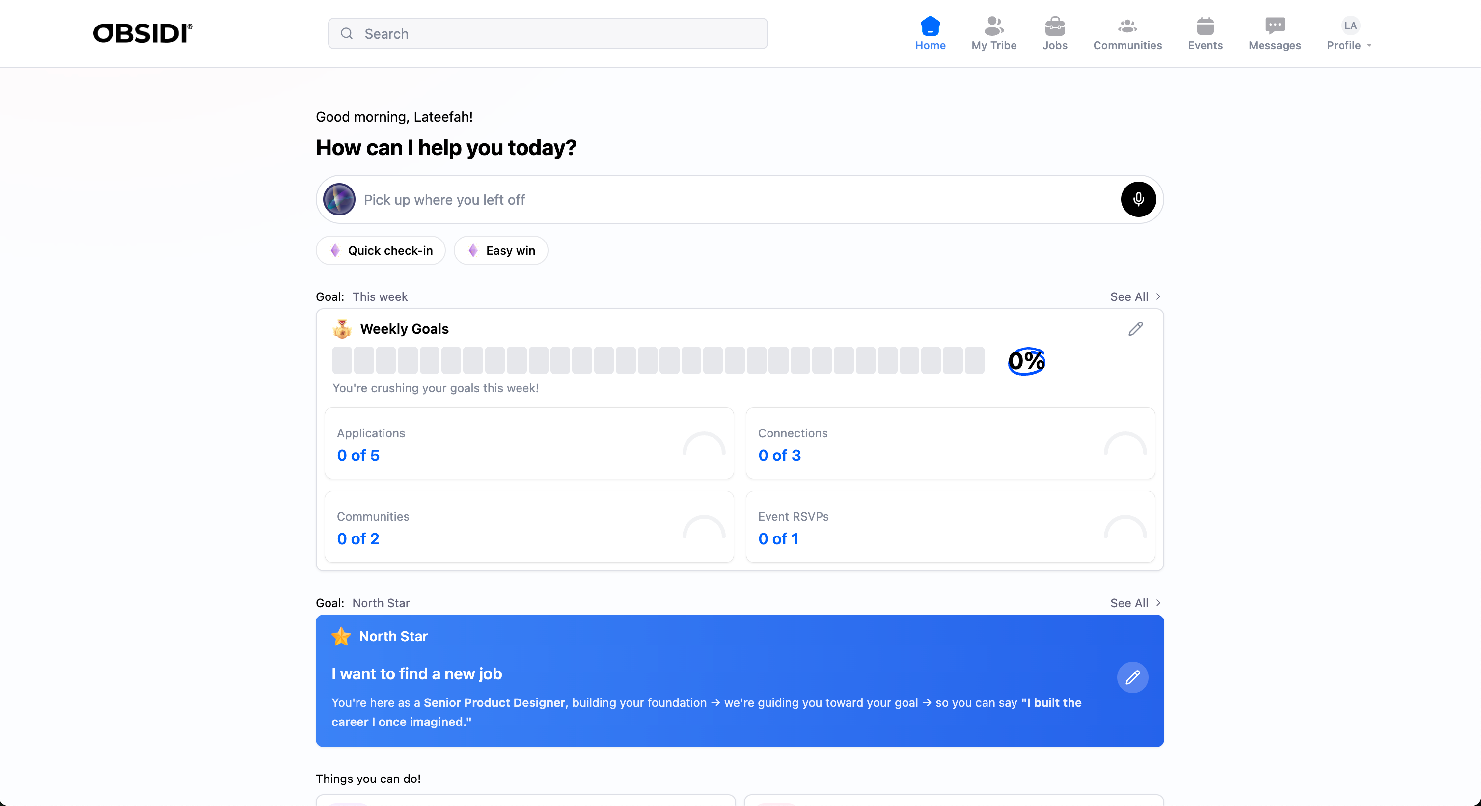
Progress visibility at a glance
Circular trackers, streak indicators, and achievement badges help users feel momentum.
03
Conversational UI that feels human
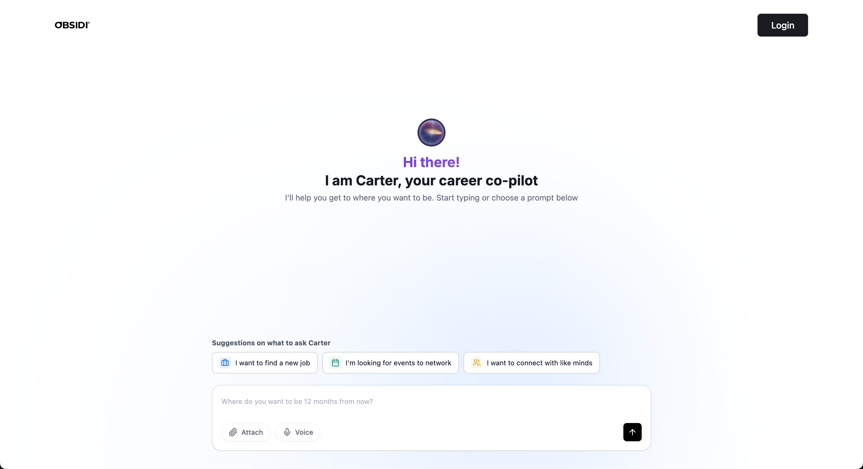
Carter’s interface is approachable: rounded surfaces, a friendly orb, and subtle micro-interactions.
04
Accessible for all user types
Clear typography, balanced contrasts, intuitive card layouts, and voice input support different comfort levels.
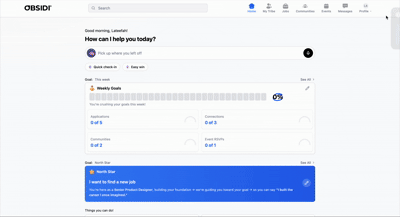
Key Visual Components
01
Voice orb + microphone interaction
02
Weekly Goals card system
03
North Star banner
04
Job card redesign with “Why You Should Apply”
05
AI tags for improvements (e.g., Tailor Your Resume to a specific role)
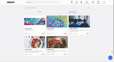
06
New Communities creation workflow using AI Image Generation
07
Redesign of Messages to include filters & cleaner chat UI


Solution
REFINING USER FLOWS, INTERACTIONS & AI BEHAVIOUR THROUGH RAPID CYCLES
Iterations were continuous and deeply informed by real users. What was improved:
01
Dashboard clarity
Users struggled with understanding what to do next. We added:
- Quick Check-In
- Easy Win
- Progress counters
- Weekly goal summaries
02
Job experience upgrades
Users wanted to know why a job was relevant. We added:
- AI-generated “Why You Should Apply”
- Suggested next steps after an application
- Resume + Cover Letter tailoring flows
03
Goal creation
Earlier versions felt restrictive. V3 allows:
- typed goals
- voice-based goals
- multi-layered (week → quarter → year) structure
04
Motivation systems
Badges, streaks, notes, and weekly summaries were added to help users feel rewarded, not overwhelmed.
05
Communities upgrade
We removed the friction of finding an image by adding AI-generated community images.
These iterations were essential to making Carter feel like a true co-pilot, not just a chatbot.

REFLECTION & IMPACT
BUILDING AN ENTIRE V3 IN FOUR DAYS & CREATING REAL VALUE FOR USERS
This project was fast, intense, and incredibly rewarding. Using Lovable AI for the first time, I designed and shipped:
- a complete UX,
- polished UI system,
- and generated front-end code, all while balancing strategy, research synthesis, and real-time feedback.
Impact achieved:
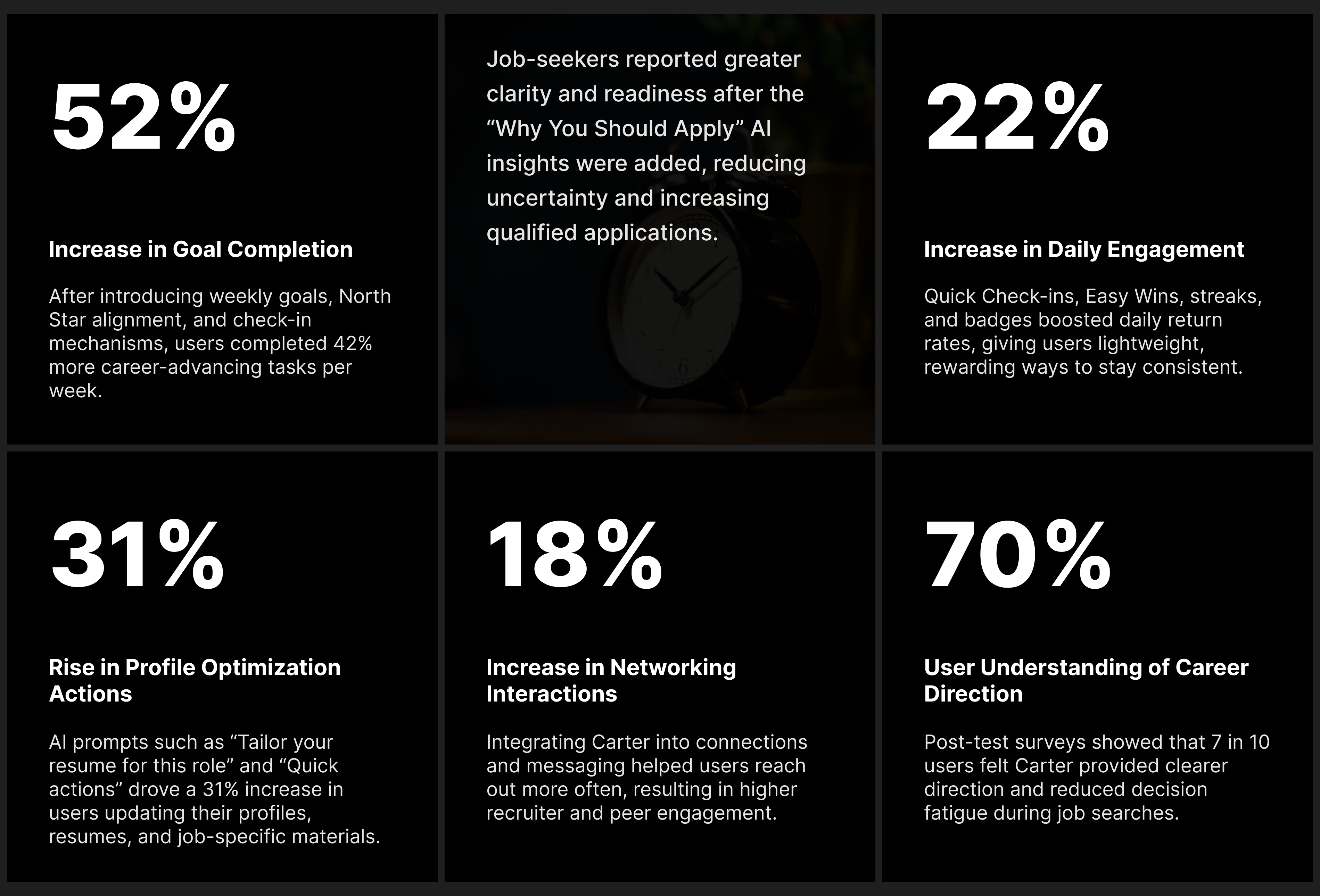
01
Fully functional V3 delivered in 4 days
02
AI job recommendations saw significantly higher engagement
03
Weekly goals improved user clarity and direction
04
Check-ins increased daily return interactions
05
Users expressed that Carter felt more “human” and “motivating”
06
Strong foundation for V4 with more personalization & intelligence
Personal Reflection
This project reminded me that creativity accelerates under constraints.
With limited time, I leaned heavily on:
- rapid decision-making,
- system thinking,
- UX clarity,
- design storytelling,
- and iterative prototyping.
It pushed my ability to design lean but high-impact features, without compromising user experience.

