Go Back
Design Systems - IL


Design Systems - IL
Overview
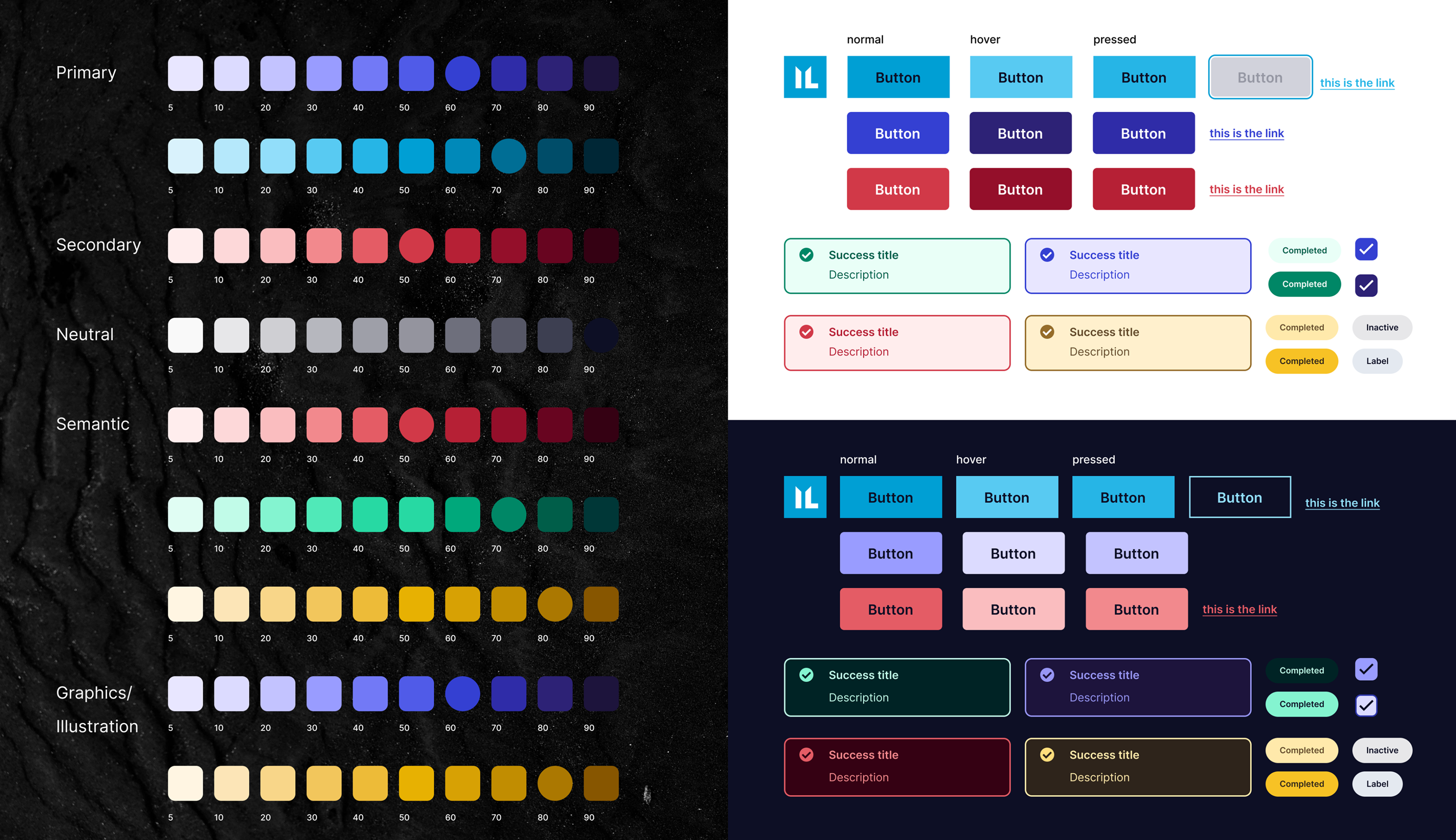
The Immersive Labs design system overhaul was aimed at creating a stronger, more cohesive brand presence across the platform and marketing site. The project focused on defining a clear color hierarchy, improving accessibility, and ensuring consistency in visual design while streamlining collaboration between design and development teams. By implementing a scalable, accessibility-compliant system, the redesign enhanced brand recognition, improved user engagement, and reduced inefficiencies in the product development workflow.
Teams
UX Team, Engineers, Product Manager
Roles
Visual Design, Prototyping
problem statement
The existing design system for the Immersive Labs platform lacked visual consistency and a defined color strategy, leading to a fragmented user experience across the platform and marketing site. This inconsistency weakened brand recognition, created usability challenges—particularly for users with accessibility needs—and increased the time and effort required for design-to-development handoffs.
There was a critical need for a refreshed design system that would unify the platform’s visual language, establish a clear and functional color hierarchy, and ensure accessibility compliance. The goal was to create a scalable, cohesive design framework that would strengthen the brand identity, enhance user experience across technical and non-technical teams, and improve operational efficiency for design and development teams.
research
AUDITING THE EXISTING SYSTEM AND IDENTIFYING GAPS
To kick off the project, I conducted a comprehensive audit of the existing design system across both the platform and the marketing site. This involved a heuristic evaluation to identify inconsistencies in visual elements, particularly in color usage, typography, and component styling.
01
Competitive Analysis
I complemented this audit with competitive analysis, examining how industry leaders—such as platforms like Cybrary and Hack The Box—utilize design systems to maintain brand consistency while ensuring usability across technical and non-technical interfaces.
02
Stakeholder Collaboration
I collaborated with cross-functional stakeholders, including developers, marketing teams, and brand strategists, to gather qualitative insights. This ensured that the updated design system would not only reflect the brand’s evolving identity but also function seamlessly for both user-facing and internal teams.
03
Accessibility Analysis
I audited the existing color palette against WCAG 2.1 standards, identifying areas where contrast ratios fell short, particularly in high-traffic areas of the platform. These insights set the foundation for defining an accessible and functional color hierarchy.

Ideation
CREATING A BOLD, ACCESSIBLE, AND FUNCTIONAL VISUAL LANGUAGE
With the research insights in hand, I facilitated a series of collaborative workshops involving designers, developers, and brand specialists. The goal was to align on a refreshed visual direction that would reinforce Immersive Labs’ bold, innovative identity while ensuring consistency across the platform and marketing site. Through iterative prototyping, I established a process for a scalable color hierarchy, refined component styling, and ensured accessibility compliance. I explored multiple design directions, focusing on:
01
Color Heirarchy
Developing clear roles for primary, secondary, and accent colors, ensuring they had distinct functional purposes (e.g., calls to action, alerts, background).
02
Accessibility-First Approach
Using tools like Stark and Figma’s contrast checker to create color scales that adhered to accessibility standards without compromising visual appeal.
03
Visual System Components
Redesigning foundational elements such as typography scales, spacing, and interactive components, ensuring a cohesive design language across all user touchpoints.


Testing
VALIDATING DESIGN DECISIONS FOR USABILITY AND ACCESSIBILITY
To validate the effectiveness of the new design system, I conducted a series of usability tests with a diverse group of participants from different roles—developers, cybersecurity specialists, and executives—mirroring the platform’s core audience. The testing focused on three key areas:
01
Visual Recognition
Assessing if users could easily recognize elements aligned with the Immersive Labs brand across both the platform and marketing site.
02
Accessibility Compliance
Verifying that color contrasts were sufficient for users with visual impairments, using tools like Lighthouse for automated audits and manual testing with users who have color blindness.
03
Consistency in User Experience
Observing how users navigated between the platform and marketing site, ensuring a seamless experience that reinforced the brand’s identity.
Feedback from these sessions led to minor adjustments in color contrast and typography weight, enhancing both readability and visual balance without diluting the bold aesthetic.

REFLECTION & IMPACT
STRONGER BRAND, HIGHER ENGAGEMENT, EFFICIENT WORFLOWS
This design system overhaul delivered tangible improvements that extended beyond visual enhancements, directly contributing to both user engagement and operational efficiency.
Key Outcomes:
01
Increased Design Consistency by 35%
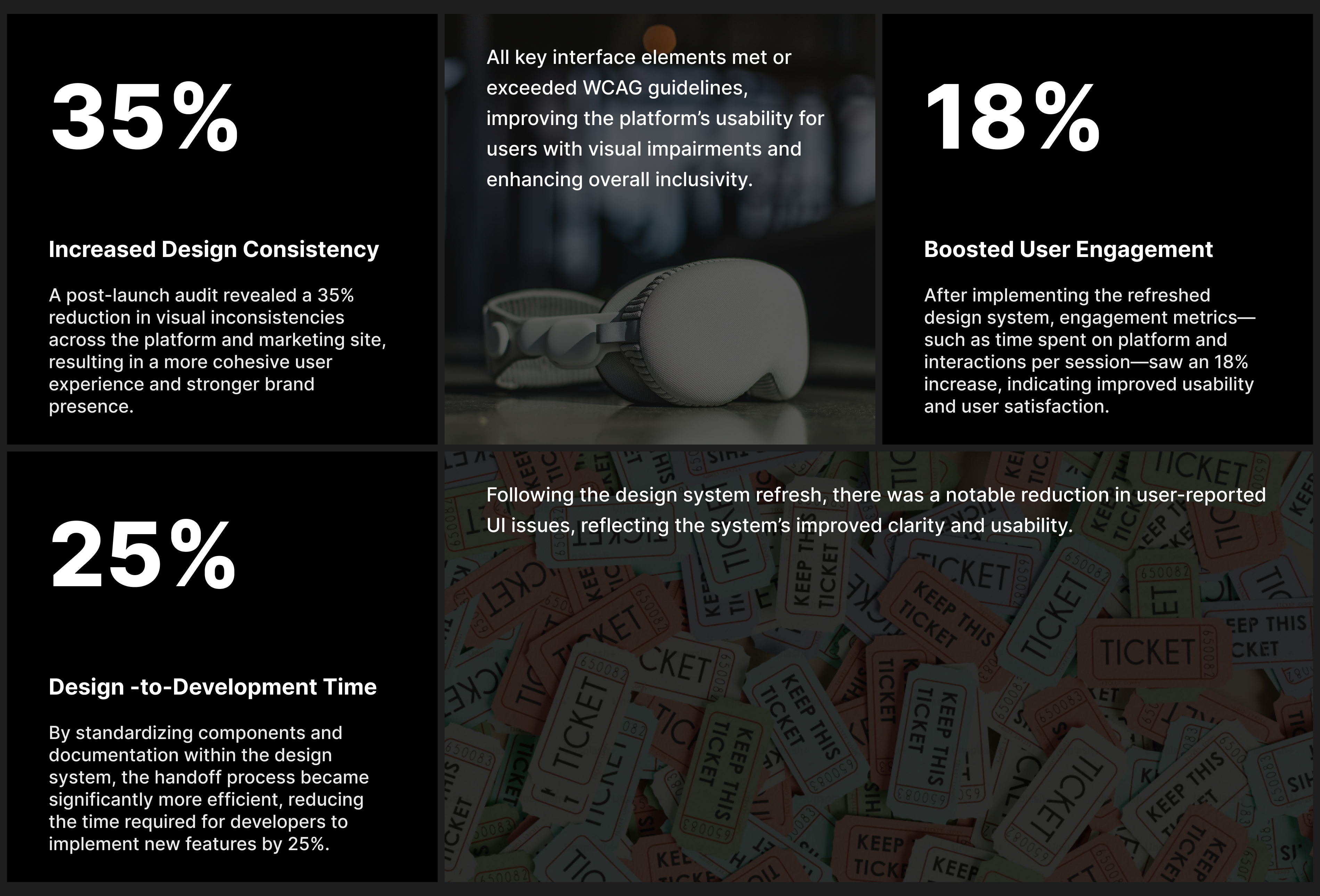
A post-launch audit revealed a 35% reduction in visual inconsistencies across the platform and marketing site, resulting in a more cohesive user experience and stronger brand presence.
02
Boosted User Engagement by 18%
After implementing the refreshed design system, engagement metrics—such as time spent on platform and interactions per session—saw an 18% increase, indicating improved usability and user satisfaction.
03
Accessibility Compliance Achieved 100% WCAG 2.1 AA Standards
All key interface elements met or exceeded WCAG guidelines, improving the platform’s usability for users with visual impairments and enhancing overall inclusivity.
04
Cut Design-to-Development Time by 25%
By standardizing components and documentation within the design system, the handoff process became significantly more efficient, reducing the time required for developers to implement new features by 25%.
05
Decreased Support Tickets Related to UI Issues by 20%
Following the design system refresh, there was a notable reduction in user-reported UI issues, reflecting the system’s improved clarity and usability.
Personal Reflection:
This project was a pivotal experience in balancing creative vision with measurable business outcomes. The quantifiable improvements in engagement, accessibility, and development efficiency reaffirmed the value of a robust, user-focused design system. Collaborating across departments to align business goals with design solutions sharpened my strategic thinking and strengthened my ability to drive meaningful impact through design.
Business Impact:
01
Strengthened brand recognition contributed to increased client retention, with a 12% uptick in enterprise renewals within three months post-launch.
02
Enhanced accessibility and usability supported broader adoption across diverse teams, leading to a 10% increase in platform usage among non-technical roles such as executives and HR professionals.

