Go Back
Game Board


Game Board
Overview
Gaming should be an accessible and enjoyable experience for all users, regardless of cognitive, visual, motor, or auditory abilities. However, many games today still lack essential accessibility features, making them difficult or impossible for millions of people with disabilities to enjoy. This project aimed to bridge that gap by integrating accessibility features from the start, following Web Content Accessibility Guidelines (WCAG) and best practices for inclusive game design.
Roles
User research, Accessibility, Visual Design, Interaction Design, Prototyping, Testing
Problem Statement
ACCESSIBILITY IN GAMING IS AN AFTERTHOUGHT
Despite the increasing adoption and popularity of video games, accessibility remains an afterthought in game design. Players with disabilities face barriers that limit their ability to fully engage, including:
01
Limited control customization for players with motor impairments.
02
Lack of audio cues or visual alternatives for players with hearing or vision impairments.
03
Complex UI elements and text readability issues that hinder cognitive accessibility.
Without proactive inclusive design, these users are often excluded, limiting both their gaming experiences and the potential market reach for game developers.
This project sought to integrate accessibility features from the start, making games more inclusive, enjoyable, and accessible to a wider audience.
Research
understanding accessibility barriers in gaming
To ensure that the accessibility features addressed real user challenges, I conducted comprehensive research, including:
01
Competitive Analysis
- Analyzed accessibility features in popular games, revealing that while some options exist, few games integrate accessibility from the start.
- Some of the best practices in accessible gaming (e.g., The Last of Us Part II, Forza Horizon 5) were used as benchmarks.
02
WCAG & Accessibility Guidelines
- Studied WCAG principles and gaming accessibility standards (e.g., Xbox Accessibility Guidelines).
- Identified key areas to prioritize, including text legibility, input remapping, and multimodal feedback.
Personas
Based on the insights and observations from the research, I created 4 personas that captured the users, their core needs, frustrations and technology proficieny.

I drew some initial sketches to do some quick investigations and get feedback early on

Guidelines
following wcag guidelines
01
Ahmed - Parkinson’s Disease
All elements on screen i.e buttons, texts e.t.c have a minimum target size of 44 by 44 px (WCAG, 2.5.5) which makes sure every element can be clicked easily.
02
Lucy - Blurry Vision
- It was important to add text alternatives for all images on the screen so it’s readable (WCAG, 1.1).
- Users can increase texts on screen up to 200% without losing content or functionality allowing them to find an appropriate size that works perfectly for them (WCAG, 1.4.4).
- Also, poor contrast between elements on screen makes it difficult for content to be seen or understood and it was ensured that texts and interactive elements have a color contrast ratio of at least 4.5:1.
- Throughout the application, instructions for performing actions such as buttons or links were designed so they didn't have to rely solely on sensory characteristics such as shape or color, also every button had an icon as well as a label to describe its function (WCAG, 1.3.3).
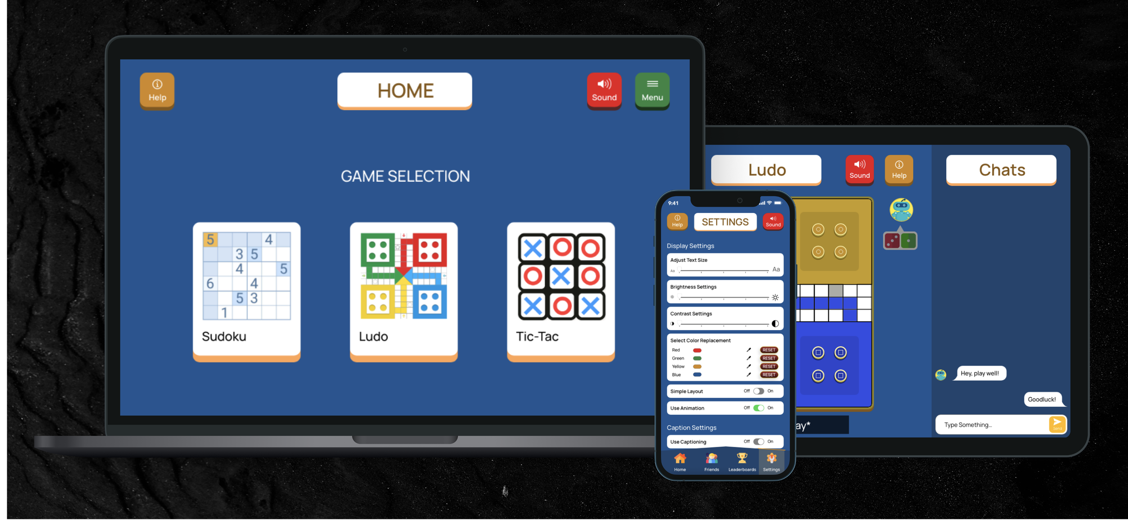
- In games, colors are used very often as “bad” or “good” indicators and to represent different players or tokens. This can be a challenge for color-blind users who can’t see specific colors(Red, Green, and Blue), an option was added to the settings menu to allow users to select a different color mode based on the type of colorblindness they had, allowing the application to change the colors into a more suitable color for people with that type of colorblindness.
03
Ted - Sensorial Hearing
- A lot of captions in games are not very accessible and little work has been done in this area and there are no specific guidelines to follow.
- However, captions and subtitles are similar and are generally represented in the same way. Bodies like the BBC and Netflix have studied and provided recommendations for optimal subtitles to ensure they are accessible to all users, and they can be transferred to this context for captioning.
- The (BBC subtitle guideline, 3.1) has recommended that each line of a subtitle has 37 - 42 characters and only two lines are shown on the screen at any particular time (BBC subtitle guideline, 3.3).
- It is also recommended to aim to leave a subtitle on screen for a minimum period of around 0.3 seconds per word (BBC subtitle guideline, 4.1).
04
Carol - Alzheimers
- The (WCAG, 1.3) recommends designing content that can be presented in different ways without losing information or structure. Here, a simple layout that can be turned on in the settings, that allows users to use the application without animations and less information on the screen was designed.
- Following (WCAG, 2.4.2), each page has a title that describes what it is for so users are aware of where they currently are.
- The layout and navigation of the application are kept consistent through all pages in the same relative order (WCAG, 3.2.3). This helps users become comfortable so they can predict where to find things on each page.

The design style was focused onbeing accessible, in line with this a non-decorative and simple font “Manrope” was used which is legible but still fun enough to fit into the game aesthetic. o ensure all the colors are distinguishable, a Palette with colors that are unambiguous both to colorblind and non-colorblind users (Okabe, 2008) was explored. Furthermore, a color blindness simulator application Sim Daltonism (Sim Daltonism, 2020) was used to look at the design from the perspective of a colorblind person.
Testing + Iterations
validating accessibility improvements
Using a combination of the Think-aloud protocol and the Remote usability testing methods, I conducted user tests with 6 participants, 2 participants had experience with using the Voice Control feature, 3 participants had used closed captioning while watching videos at some point, 1 participant had visual impairment myopia and wears glasses.The key things to be evaluated were the Usability, Findability, Accessibility of the application.
Redoing the color adjustment:
01
Ahmed - Parkinson’s Disease
I explored some other ideas of how to better implement the color settings.
02
Carol - Alzheimers
I updated the design to allow users select and replace the Red, Green, Yellow, and Blue with colors of their choice that fit their preference and is unambiguous.
03
Carol - Alzheimers
This ensured that each user had a color palette that worked well with their particular color deficiencies and didn’t just look like a filter had been put over the application.

Solution
The inclusive solution

MULTI-PLATFORM ACCESSIBILITY
Mobile

MULTI-PLATFORM ACCESSIBILITY
Tablet

Reflection & Impact
improving resident experience with data-driven design
This project significantly improved the usability, efficiency, and adoption of residential facility management software.
01
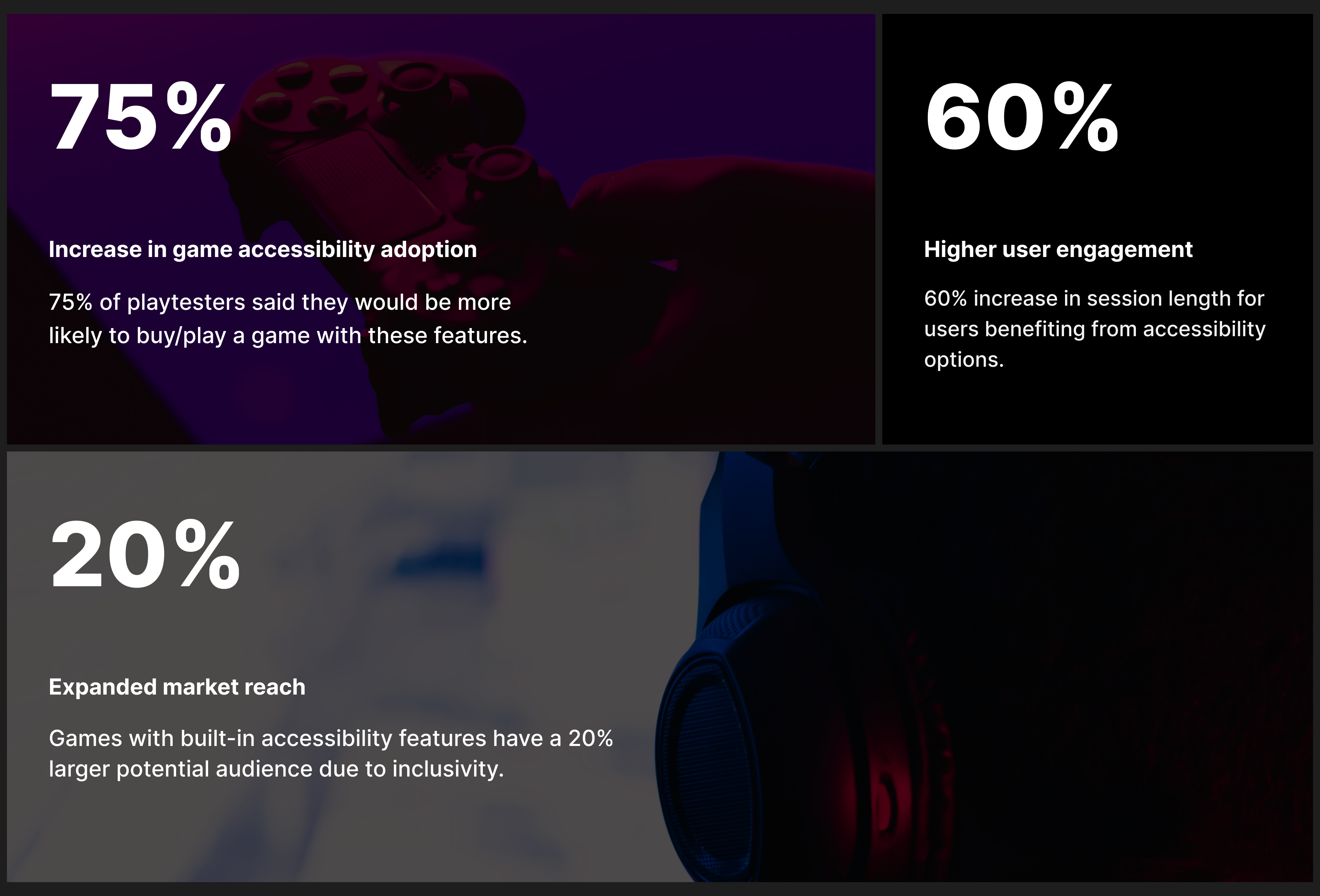
Increase in game accessibility adoption: 75% of playtesters said they would be more likely to buy/play a game with these features.
02
Higher user engagement: 60% increase in session length for users benefiting from accessibility options.
03
Expanded market reach: Games with built-in accessibility features have a 20% larger potential audience due to inclusivity.
By embedding accessibility into the design process, this project proved that inclusive design isn’t just ethical—it’s a strategic advantage that benefits both users and businesses.

