
Go Back
HealthSpan


HealthSpan
Overview
Before this project, members completed their bloodwork externally using requisition forms. Results were interpreted by a Nurse Practitioner and discussed with the member during a call, but members didn't have a persistent, in-product way to access or understand those results.
Healthspan introduced a new at-home blood-testing product line. Members could order a collection kit, receive it at home, collect their sample and return it for processing, creating an entirely new physical and digital journey for Science & Humans.
I joined the project at discovery and designed both sides of the experience: the member journey for completing an at-home test and the internal workflows required to identify returned kits, process results, complete clinical review and publish those results back to members.
As the project evolved, this also led to Insights — a new dashboard experience designed to turn dense clinical results into health information members could more easily understand and revisit.
Teams
Product Manager, Software Engineer, Clinicians
Roles
Discovery, User flows, UX/UI design, Prototyping, User Testing
DISCOVERY
Understanding the system before designing the screens
At-home blood testing introduced more than a new interface. A single order would move between the member, Science & Humans, fulfillment partners, couriers, the lab and clinicians before a result could make its way back to the member.
I started by mapping the end-to-end service to understand where digital interactions intersected with physical operations.
The journey included:
Purchase → Fulfillment → Delivery → Activation → Collection → Return → Lab processing → Clinical review → Results
Behind that seemingly linear member journey were multiple systems and partners, including LMX for kit fulfillment, MedsOnWheels for shipping and pickup, the lab for sample processing, and the Science & Humans team for operational oversight and clinical review.
Mapping the complete system helped identify where the product needed to provide guidance to members, where internal teams needed visibility or intervention, and where status changes needed to move between systems.


DEFINING THE MEMBER EXPERIENCE
Connecting a physical testing journey to the member dashboard
One of the core design challenges was that much of the experience happened away from the screen. Members needed to receive a medical collection kit, correctly use it on their own, prepare it for return and coordinate its journey back to the lab.
The dashboard therefore needed to do more than display an order status. It needed to guide members through the right action at each stage.
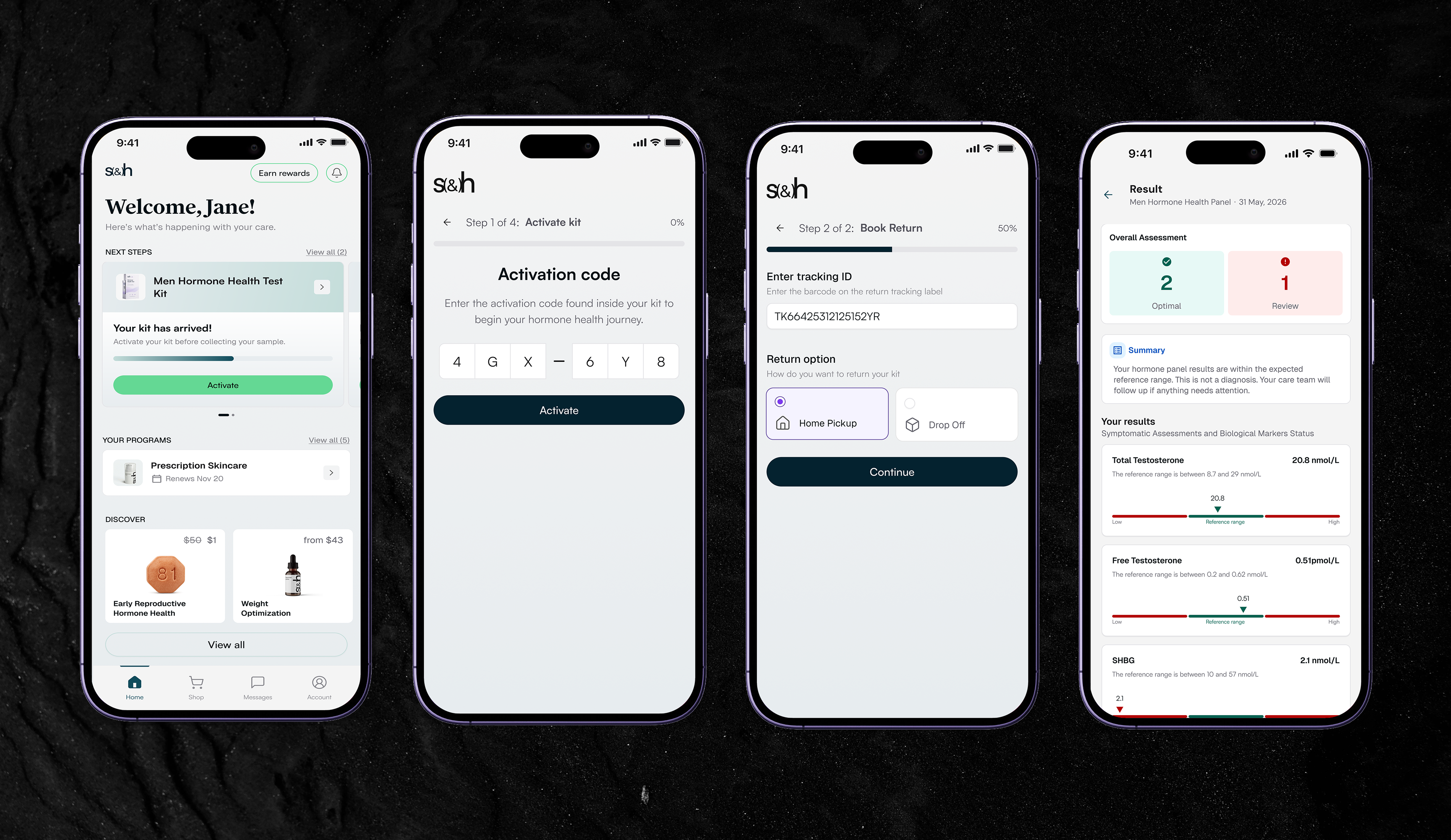
I designed the experience around the lifecycle of the kit:
01
Before delivery
Members could track the kit while waiting for it to arrive.
02
Activation
Once delivered, the member activated the physical kit using its unique activation code, connecting the sample to their account.
03
Collection
The experience introduced what to expect, provided instructions for using the kit and allowed members to record the information required for their collection.
04
Return
Members could select the appropriate return option and schedule the sample for pickup or drop-off.
05
Post-return
The dashboard continued reflecting the state of the test as it moved through processing.
This turned the dashboard into a companion for the physical experience rather than simply another place to view an order.
DESIGNING THE OPERATIONAL EXPERIENCE
Starting comprehensive, then deliberately reducing scope
My initial Admin concept mirrored the complexity of the overall Labs operation.
I designed a comprehensive internal tool that would allow the Labs team to follow an order across its full lifecycle — including kitting, outbound shipping, delivery, activation, inbound returns, lab processing, results and completion.
The concept also included detailed order tracking, reorders and member communication.
![[object Object]](/_next/image?url=https%3A%2F%2Fcdn.sanity.io%2Fimages%2Flixlfaaj%2Fproduction%2Fc8c7d66a698dae494327ff79ad11686f8d20c702-6048x3928.png%3Fw%3D1800%26fm%3Dwebp%26fit%3Dfillmax%26auto%3Dformat&w=3840&q=80)
![[object Object]](/_next/image?url=https%3A%2F%2Fcdn.sanity.io%2Fimages%2Flixlfaaj%2Fproduction%2F41c89f19a5289e564c650f12f6b008185a95fe74-6048x3928.png%3Fw%3D1800%26fm%3Dwebp%26fit%3Dfillmax%26auto%3Dformat&w=3840&q=80)
![[object Object]](/_next/image?url=https%3A%2F%2Fcdn.sanity.io%2Fimages%2Flixlfaaj%2Fproduction%2Ff1ee2b4fd5cbc7c83f3577977e437afe3ddb5811-6048x3928.png%3Fw%3D1800%26fm%3Dwebp%26fit%3Dfillmax%26auto%3Dformat&w=3840&q=80)
But this was a new product and a new operational workflow. During reviews with the Labs team, we recognized that we were designing capabilities before the team had evidence that they would actually need them.
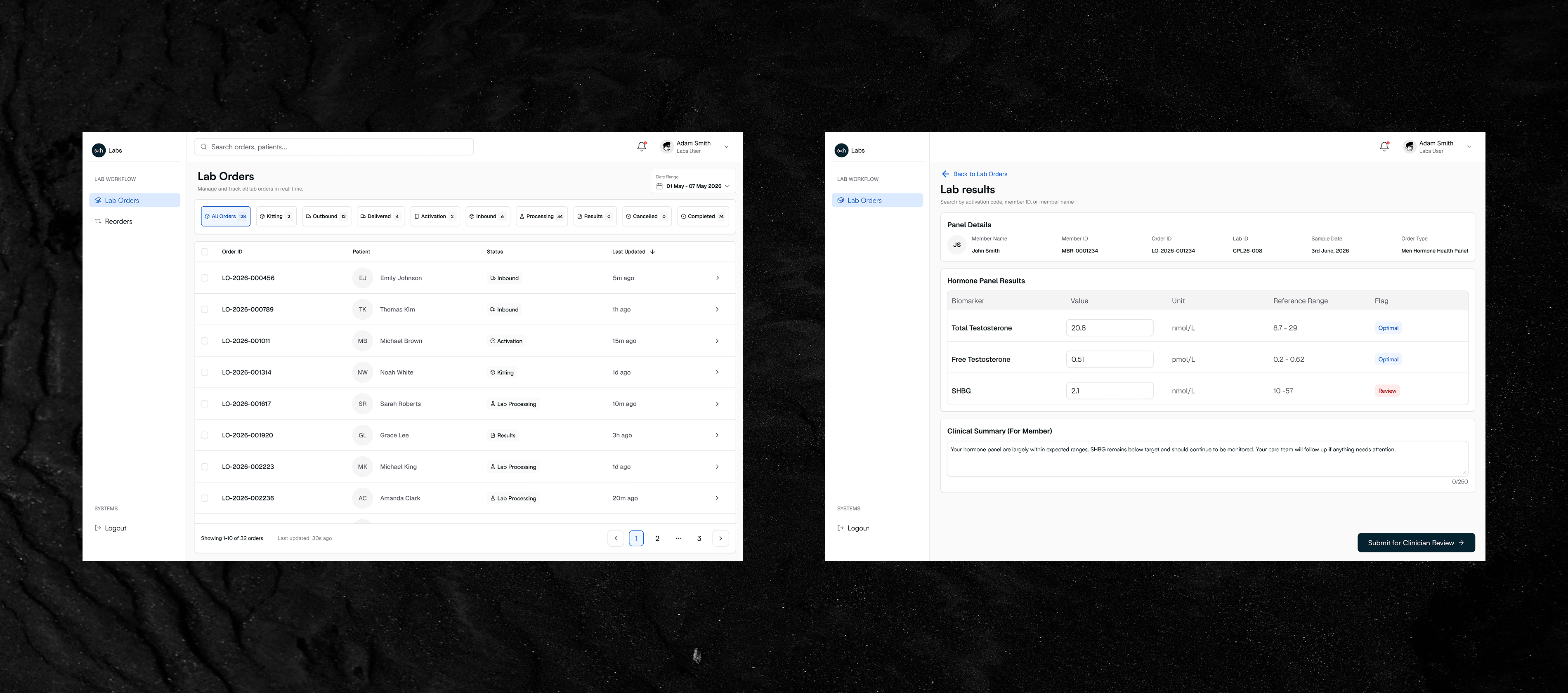
Rather than building a large operational platform around hypothetical future requirements, we reduced the MVP to the jobs the Labs team needed to perform on day one.
The MVP needed to answer a much smaller set of questions
01
Can I find the returned kit?
The team could search using an activation code, Member ID or member name and retrieve the corresponding member and order.
02
What is happening with this order?
Orders could be filtered by status, with the relevant member and order information available when needed.
03
Do I need to intervene?
The team could manage exceptions such as cancelling an order.
04
How do I process the result?
Once laboratory results were available, the team could attach the result, enter individual biomarker values and add the clinical summary required for the member experience.
05
Is it ready for the member?
Results moved through clinical review and sign-off before being published.
Detailed logistics management, reorders and direct member communication were intentionally removed from the MVP and could be introduced later if real operational usage demonstrated the need.
![[object Object]](/_next/image?url=https%3A%2F%2Fcdn.sanity.io%2Fimages%2Flixlfaaj%2Fproduction%2Fc3cc6a9d872a0c8c71f1adb8b67b8e79b96179df-5760x2360.png%3Fw%3D1800%26fm%3Dwebp%26fit%3Dfillmax%26auto%3Dformat&w=3840&q=80)
![[object Object]](/_next/image?url=https%3A%2F%2Fcdn.sanity.io%2Fimages%2Flixlfaaj%2Fproduction%2F2baca44e9bbdc26c3532d20073d193c1e9ef304b-5760x2360.png&w=640&q=80)

The goal wasn't to recreate every system involved in Labs. It was to give Science & Humans the minimum internal control required to move a returned kit safely from identification to a clinically reviewed member result.
SOLVING BEYOND THE ORIGINAL SCOPE
Physical fulfillment exposed a gap in checkout
Introducing physical products also uncovered a problem elsewhere in the Science & Humans experience.
Previously, the purchase journey followed this sequence:
Add program → Pay → Create account → Complete onboarding → Provide address
That worked for existing programs, but created a fulfillment risk for Labs.
A member could successfully pay for a physical kit and then abandon account creation or onboarding before providing their address. Science & Humans would have a valid paid order without the shipping information required to fulfill it.
One possible solution was to collect another address later during onboarding, but that would have introduced duplicated address entry and additional friction.
Instead, I redesigned the checkout flow so the shipping information required for physical products was collected before payment.
![[object Object]](/_next/image?url=https%3A%2F%2Fcdn.sanity.io%2Fimages%2Flixlfaaj%2Fproduction%2F6af8b39756052ffe153cc3f2af06e93e11f99764-6012x5796.png%3Fw%3D1800%26fm%3Dwebp%26fit%3Dfillmax%26auto%3Dformat&w=3840&q=80)
![[object Object]](/_next/image?url=https%3A%2F%2Fcdn.sanity.io%2Fimages%2Flixlfaaj%2Fproduction%2Fa3123d674afd36054e06292ecc1feb7e72f1c80a-5760x4112.png%3Fw%3D1800%26fm%3Dwebp%26fit%3Dfillmax%26auto%3Dformat&w=3840&q=80)
![[object Object]](/_next/image?url=https%3A%2F%2Fcdn.sanity.io%2Fimages%2Flixlfaaj%2Fproduction%2F07a9bbb0b9aba0ab615b6fed8c3b5ae5f12b82fd-5760x4112.png&w=640&q=80)
I worked with Product and Engineering through implementation of the change.
This solved a Labs fulfillment problem by improving a shared product flow rather than creating a Labs-specific workaround.
CLOSING THE RESULTS GAP
Giving members more than a PDF
Solving collection and processing still left one important question:
What happens when the results are ready?
Historically, members received clinical interpretation through conversations with their Nurse Practitioner. They didn't receive an in-product results experience they could revisit later.
We briefly considered making the clinical PDF available directly to members.
That would have provided access to the information, but the reports contained significant amounts of clinical content — biomarker values, reference ranges, symptomatic assessments, clinician summaries and other health information.
The opportunity wasn't simply to make the report available.
It was to make the important information understandable.
I designed Insights, a new dashboard experience that translated the clinical report into a visual hierarchy:
Overall assessment → Clinical summary → Individual biomarkers → Reference ranges → Full clinical report
Members could quickly understand which results were within the expected range and which required attention, while still retaining access to the underlying clinical report for transparency and detail.
ITERATING WITH CLINICAL EXPERTISE
One results model didn't work for everyone
The first Insights concept used the same basic results model across Men's and Women's Hormone Health.
During a design review where the Product Manager and I presented the concept to the Labs team, they surfaced an important clinical consideration.
Some women's hormone results cannot be meaningfully interpreted using a single static reference range. Hormone levels such as estradiol and progesterone vary depending on factors including the phase of the menstrual cycle when the sample was collected.
The interface therefore couldn't simply label every value as within or outside one universal range.
Designing for context, not just data
I separated the Men's and Women's results experiences rather than forcing both into the same presentation model.
For the Men's Hormone Panel, the experience retained the simpler structure of displaying biomarker values against the appropriate reference range.
For the Women's Hormone Panel, the design introduced multiple relevant reference groups and surfaced Context Required alongside Optimal and Review.
This allowed the interface to communicate an important distinction: some results weren't inherently good or bad without the clinical context required to interpret them.

The requirement also propagated backwards into the Admin experience. The internal workflow needed to support the different information required to process Men's and Women's panels before those results could appear correctly for members.
What initially appeared to be a presentation problem therefore became a system-level requirement across both sides of the product.
THE FINAL EXPERIENCE
Connecting collection, operations and understanding
The final experience connected three previously separate problems into one service.
Member Labs
Members can follow the physical testing journey through their dashboard — from receiving and activating their kit to understanding collection requirements and arranging its return.

Labs Admin
Internal teams can locate returned kits, manage orders, process biomarker results, add clinical summaries and move results through clinical review without the unnecessary complexity of the original Admin concept.
![[object Object]](/_next/image?url=https%3A%2F%2Fcdn.sanity.io%2Fimages%2Flixlfaaj%2Fproduction%2Fa58a5c5a6d34f392a1aa4246e102d2b1950b0038-6048x3928.png%3Fw%3D1800%26fm%3Dwebp%26fit%3Dfillmax%26auto%3Dformat&w=3840&q=80)
![[object Object]](/_next/image?url=https%3A%2F%2Fcdn.sanity.io%2Fimages%2Flixlfaaj%2Fproduction%2Fc9891a3402ae0913fee87b15ebfce08e52b81d33-6048x3928.png%3Fw%3D1800%26fm%3Dwebp%26fit%3Dfillmax%26auto%3Dformat&w=3840&q=80)
![[object Object]](/_next/image?url=https%3A%2F%2Fcdn.sanity.io%2Fimages%2Flixlfaaj%2Fproduction%2F2de673477649e0844cdc34a293c7ef09425a03f0-6048x3928.png%3Fw%3D1800%26fm%3Dwebp%26fit%3Dfillmax%26auto%3Dformat&w=3840&q=80)
![[object Object]](/_next/image?url=https%3A%2F%2Fcdn.sanity.io%2Fimages%2Flixlfaaj%2Fproduction%2Fc7ca4c39133dcabd9a38079fd4d682f7a791d509-6048x3928.png%3Fw%3D1800%26fm%3Dwebp%26fit%3Dfillmax%26auto%3Dformat&w=3840&q=80)
![[object Object]](/_next/image?url=https%3A%2F%2Fcdn.sanity.io%2Fimages%2Flixlfaaj%2Fproduction%2F9c5a767bfaa1b3aef4257c8ab6c2e74ea85ecbc7-6048x3928.png%3Fw%3D1800%26fm%3Dwebp%26fit%3Dfillmax%26auto%3Dformat&w=3840&q=80)
Insights
Once clinically reviewed, results become a visual member experience designed around comprehension, while the complete clinical report remains available when members want the underlying detail.
![[object Object]](/_next/image?url=https%3A%2F%2Fcdn.sanity.io%2Fimages%2Flixlfaaj%2Fproduction%2F3ddbad0794a900782381f50e2323cd607950f843-1608x3496.png%3Fw%3D1800%26fm%3Dwebp%26fit%3Dfillmax%26auto%3Dformat&w=3840&q=80)
Together, these experiences create a continuous journey:
Order → Collect → Return → Process → Review → Understand
OUTCOME
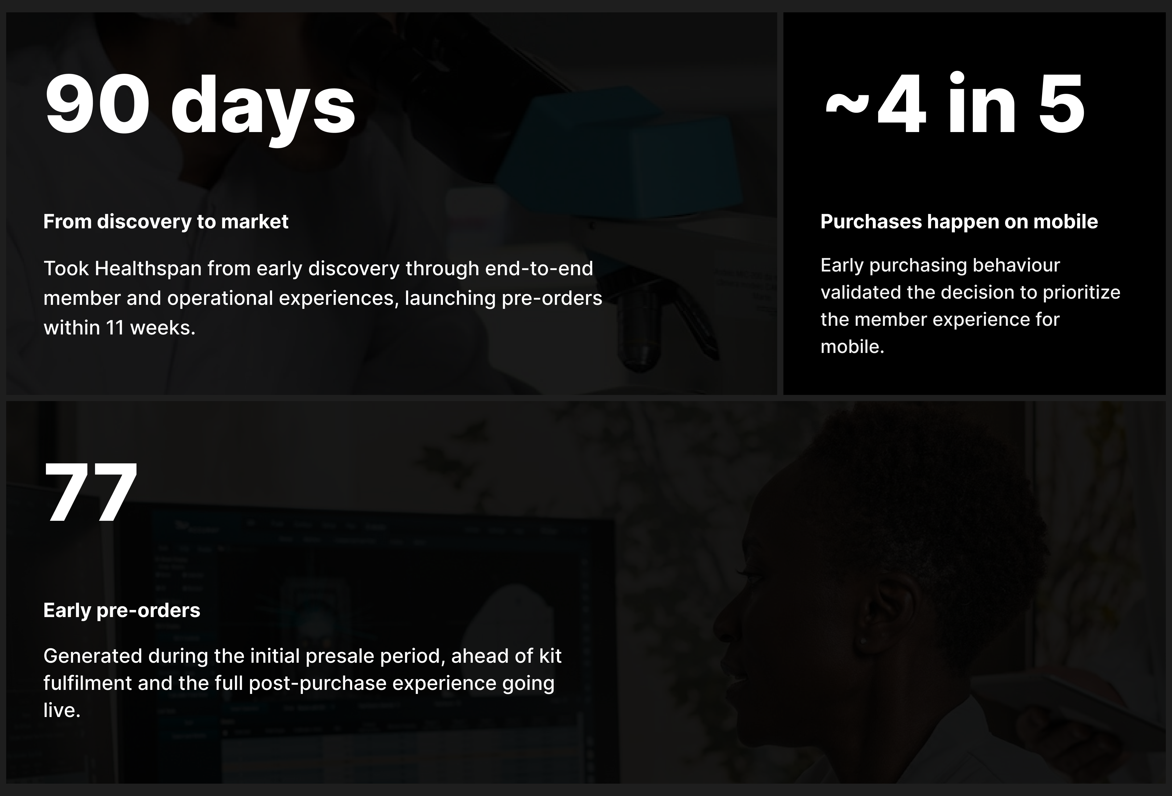
From discovery to market in approximately 11 weeks
I began discovery for Healthspan on May 5, 2026.
The product opened for pre-orders on July 22, moving from early service mapping to a functioning member, operational and results ecosystem in approximately 11 weeks.
By August 20, 77 Healthspan orders had been recorded.
Early Amplitude data from the first 30 days also showed 44 successful payments from 46 tracked payment attempts, with purchases occurring across both mobile and desktop.
Because Healthspan remains in pre-sale, the most meaningful downstream measures — kit activation, successful collection, return completion, operational processing and engagement with Insights — are not yet available.
Those behaviours will become the next indicators of how successfully the experience performs once kits begin moving through the complete journey.
01
77
Orders by Aug 20
02
~11 weeks
Discovery → pre-sale
03
44 / 46
Tracked payment attempts completed
REFLECTION
Designing the service, not just the interface
Labs reinforced the importance of understanding the system surrounding an experience before deciding what software needs to exist.
My first Admin solution attempted to give the Labs team comprehensive control because the operational journey itself was complex. Working directly with the team helped me recognize that complexity in the service didn't automatically justify complexity in the product.
Starting with a smaller operational MVP gives us the opportunity to learn from real usage before deciding which additional capabilities deserve to be built.
Insights reinforced a different lesson: in healthcare, simplifying information doesn't mean removing its context. The first results model was visually straightforward, but clinical feedback revealed where that simplicity could become misleading. Separating the Men's and Women's experiences allowed the interface to remain understandable without flattening meaningful clinical differences.
As Healthspan moves beyond pre-sale, the next phase is validation. I'll be looking at where members struggle across activation, collection and returns; what the Labs team actually needs after processing real volume; and whether members engage with and understand their results through Insights.
The project began as a new way to complete bloodwork.
It ultimately required designing the system that connects a physical sample to an understandable health result.

